Cities do not always move with their countries
May 4, 2026
This map looks at cities and countries side by side. Each city is classified by what happened between 2015 and 2025: did the city grow or shrink, and did its country grow or shrink in the same period? The country layer in the background shows annual population change, while the city points can be filtered by quadrant.
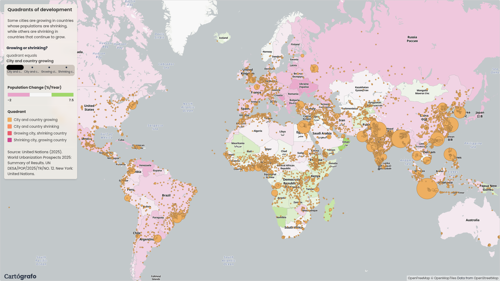
The point of the map is simple: national population change can hide what is happening inside a country. Cartógrafo makes that comparison visible by joining city-level population change with country-level change, then turning the result into four categories.
Mexico City is shrinking in a growing country
Mexico City stands out because it is a giant city moving against the national direction. Mexico is still growing, but Mexico City is shrinking. In this map, it is the largest city in the "shrinking city, growing country" quadrant.
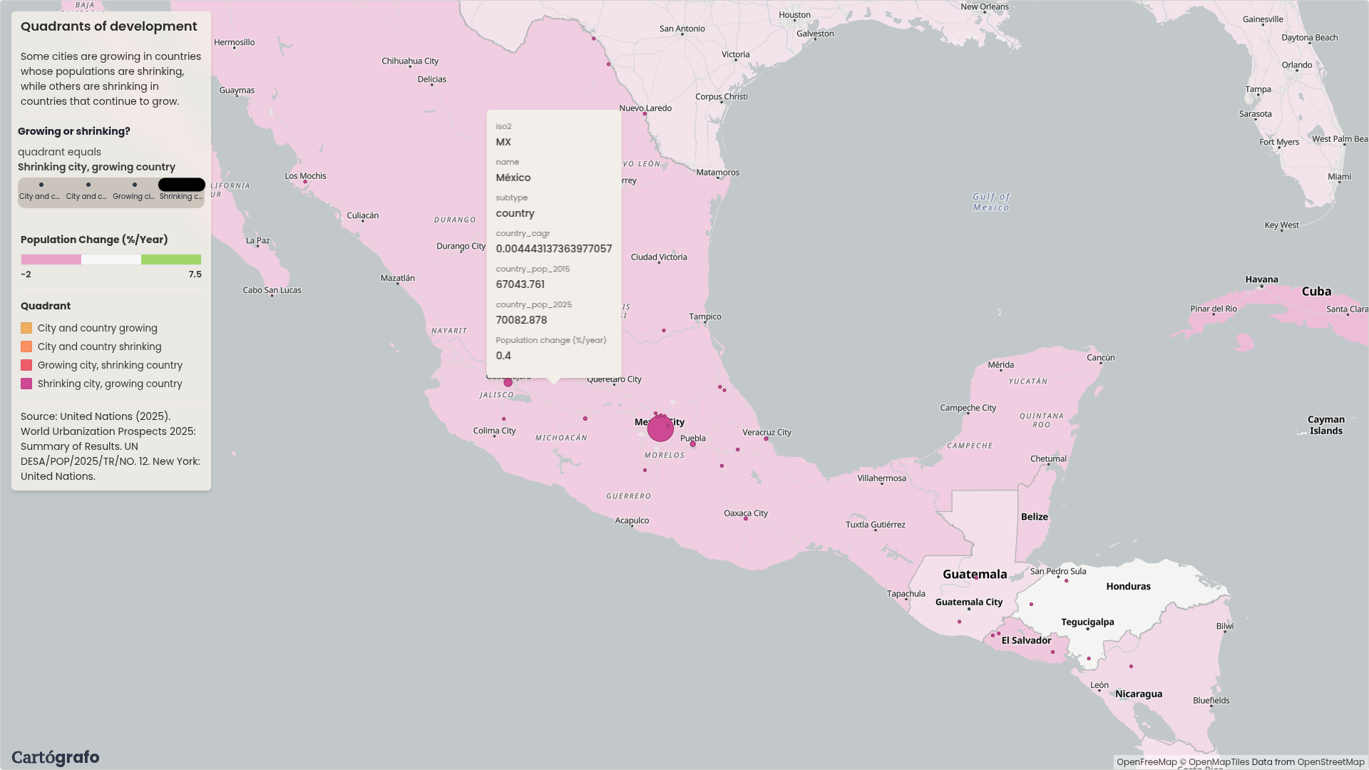
That is the kind of case that is easy to miss in a country-level map. The country still appears on the growth side, but one of its main urban centers is going the other way.
Tokyo is still growing in a shrinking country
Tokyo shows the opposite pattern. Japan is losing about 0.3% of its population per year, but Tokyo grew between 2015 and 2025. The city sits in the "growing city, shrinking country" quadrant.
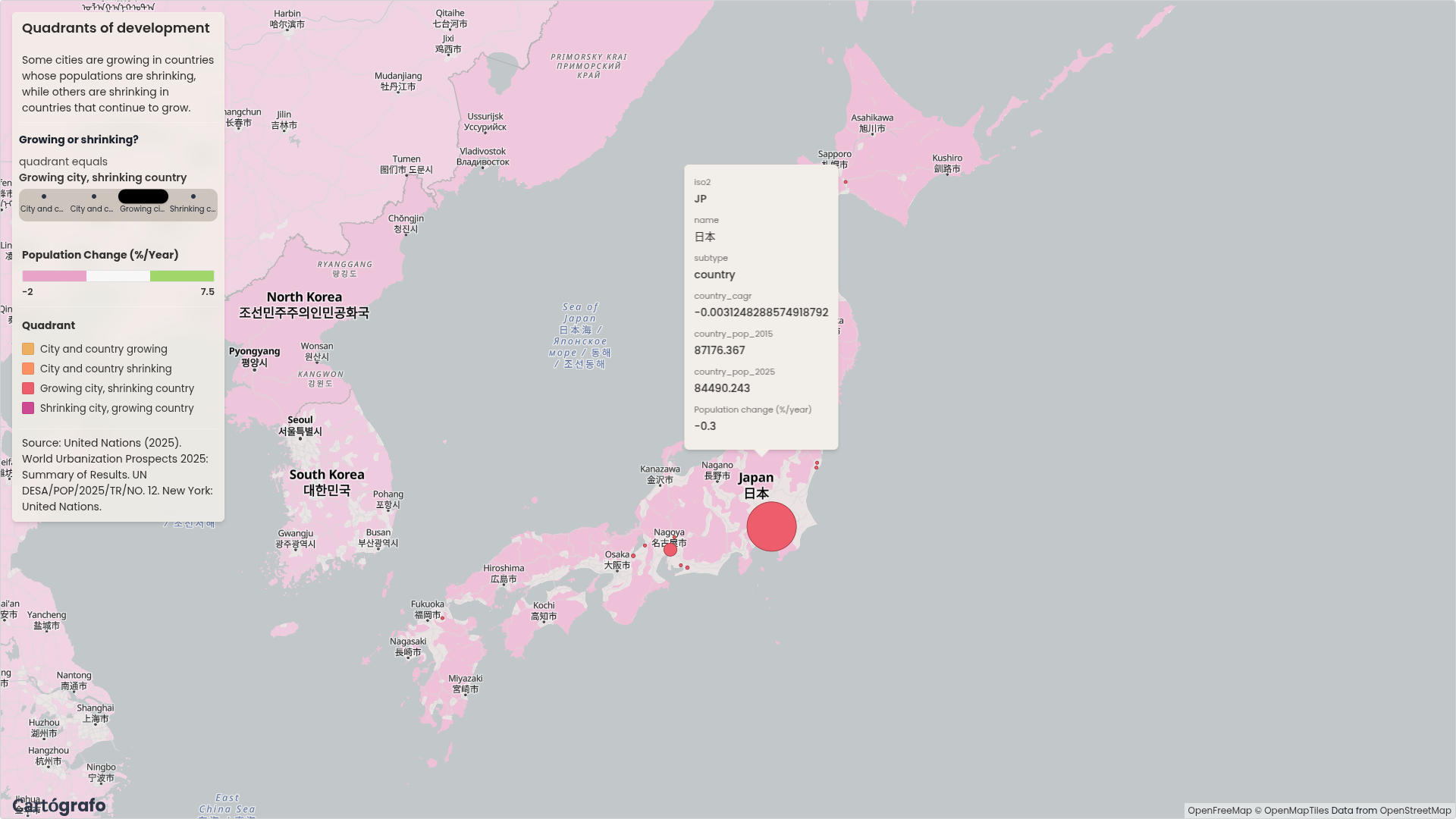
This does not make Japan a growing country. It shows that a large city can keep growing while the national population falls.
China and India show the internal pattern
China and India are useful to look at because both are growing in the country layer, but the city points are not all moving in the same direction. Some inland cities are shrinking. Larger coastal cities, such as Guangzhou, are still growing.
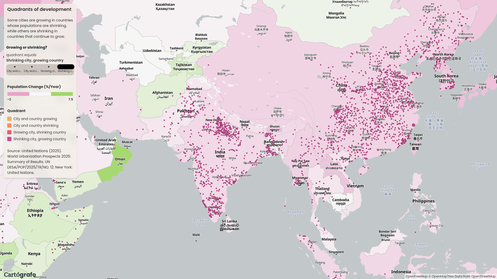
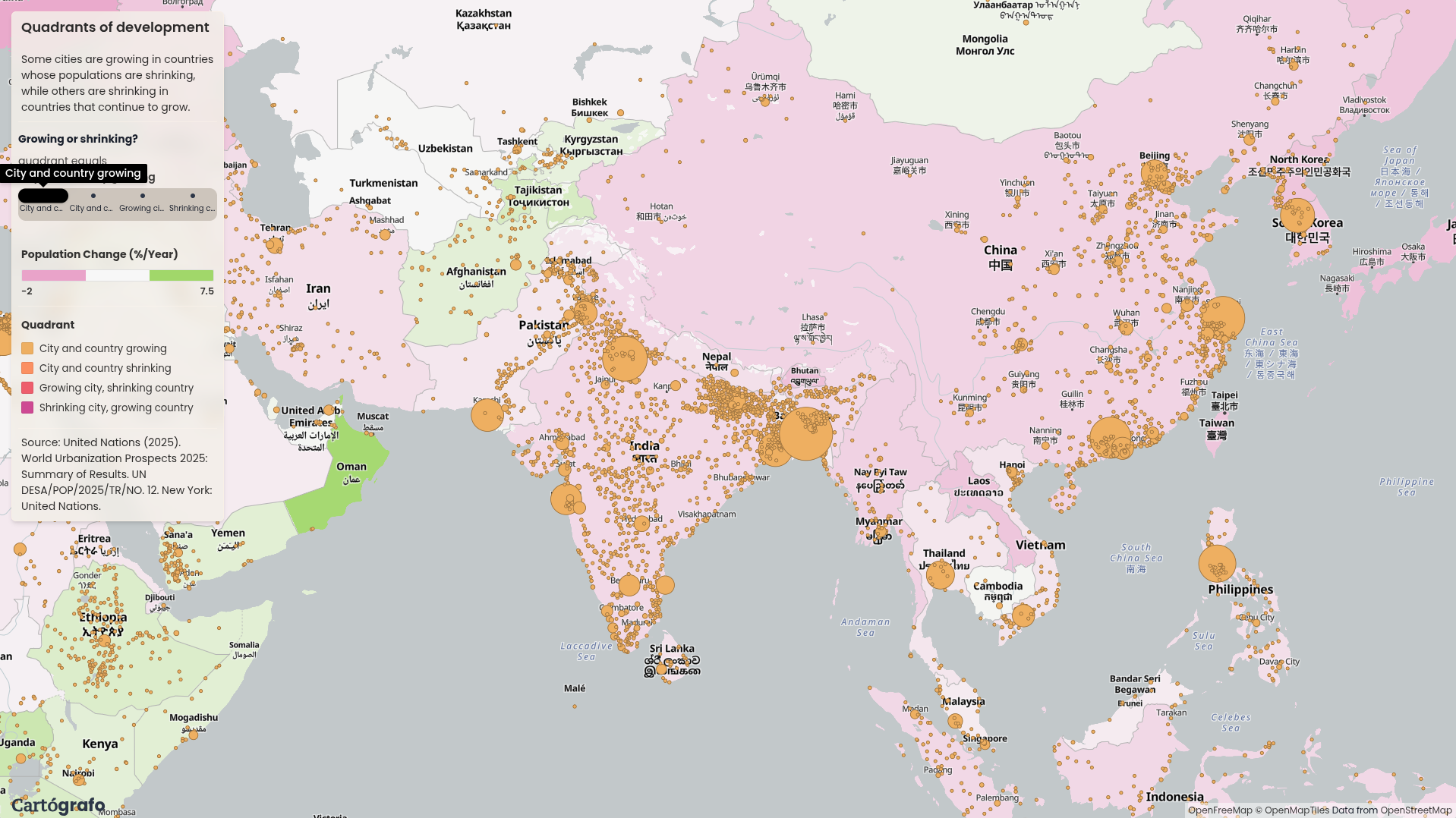
The map does not draw migration flows, but the spatial pattern is clear: growth and decline are happening inside the same national frame. Filtering the city layer makes those differences much easier to read.
Built as a graph in Cartógrafo
The map was built in Cartógrafo from WUP 2025 city data and a country boundary layer. The graph filters the city data to 2015 and 2025, calculates city and country change, joins the country metric back to each city, and classifies each city into one of four quadrants.
That workflow is the software story here: the analysis is not hidden in a script. The joins, filters, calculated columns, country layer, city layer, and filter widget are all part of the map graph.
A Map Aficionado?
Subscribe to our newsletter and receive cool maps in your inbox