When countries became mostly city-based
May 4, 2026
This map shows the predominant settlement type in each country: Cities, Towns, or Rural. It uses WUP 2025 DEGURBA Level 1 data and lets the year move from 1950 to 2050 in five-year steps.
The change is simple to read. In 1975, many countries were still predominantly rural. By 2050, far fewer will be. The map turns that shift into a timeline, so it is possible to see where the change happens early and where it does not happen at all.
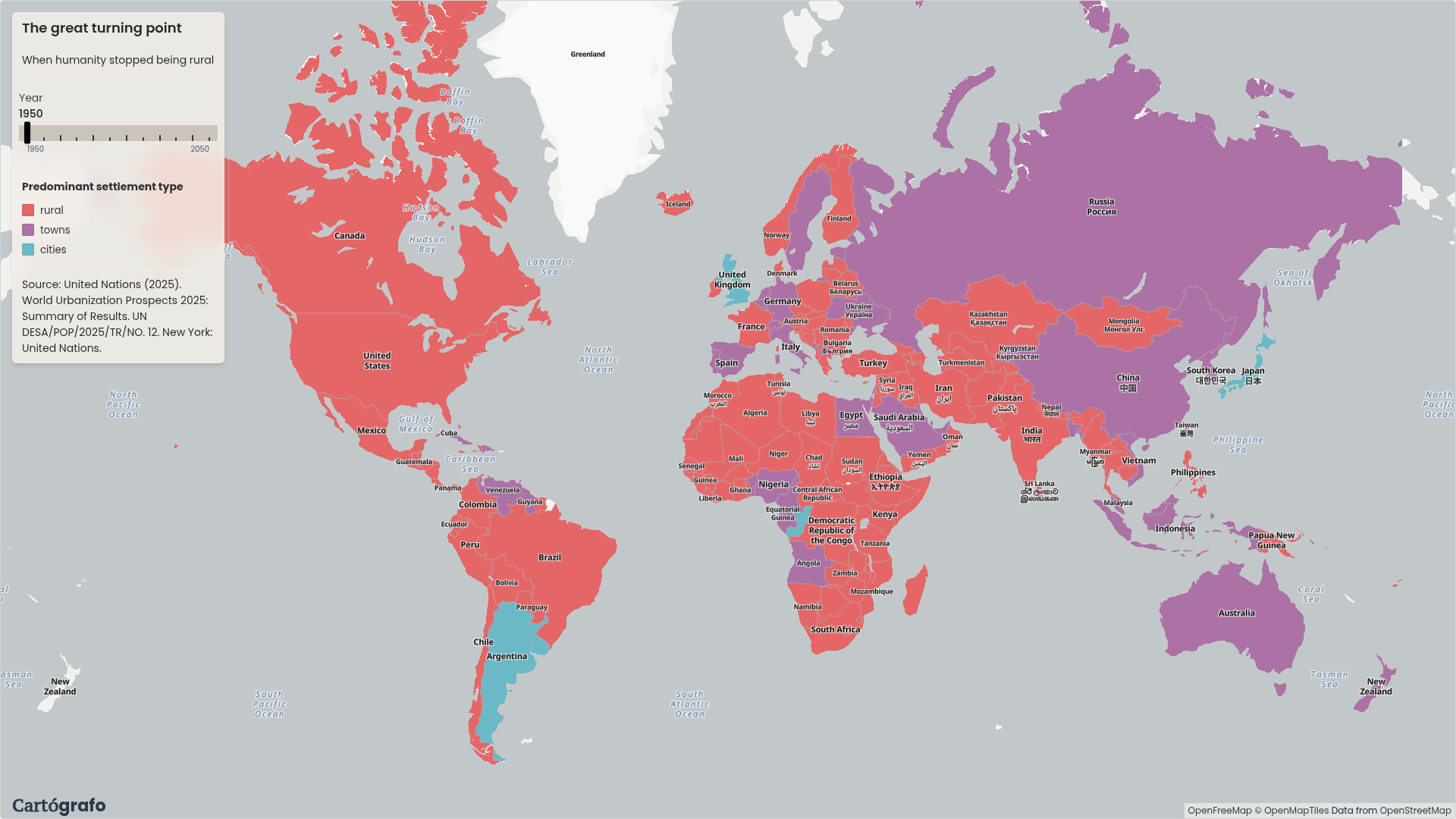
In 1975, only three countries were mostly cities
In 1975, only Argentina, Japan, and the United Kingdom were predominantly Cities in this classification. That makes the early map feel very different from the later ones. Most of the world was still either Rural or Towns-dominant.
This is the strongest starting point for the map: the world did not gradually become city-based everywhere at the same time. In the first years of the timeline, the Cities category is still rare.
Latin America changes early
By 2010, almost all of Latin America is predominantly Cities. French Guiana is the exception in the view used here.
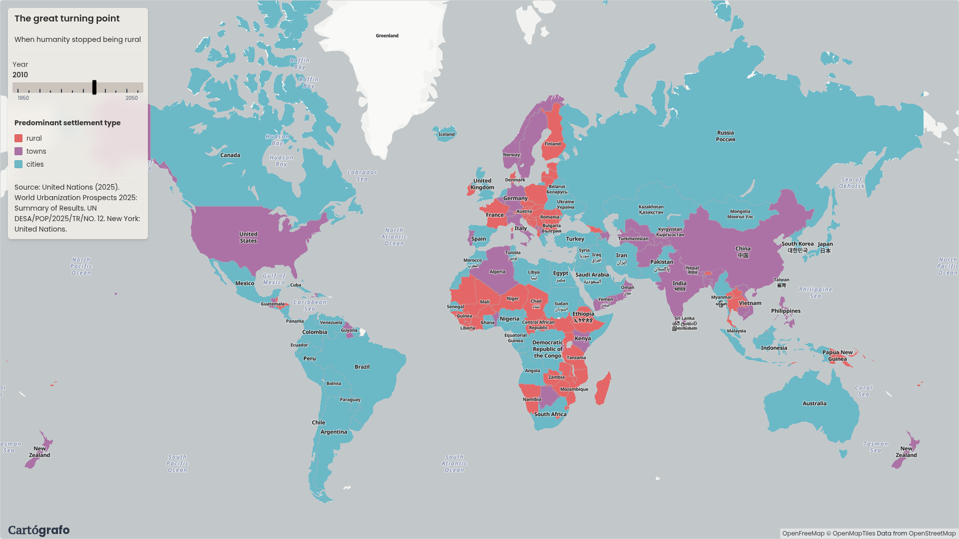
This is one of the clearest regional patterns in the map. The shift toward Cities is already visible across Latin America while other regions are still mixed.
Europe stays stable
Europe is much more stable across the timeline. Some European countries are not projected to become predominantly Cities even by 2050. France is one example in the 2050 view.
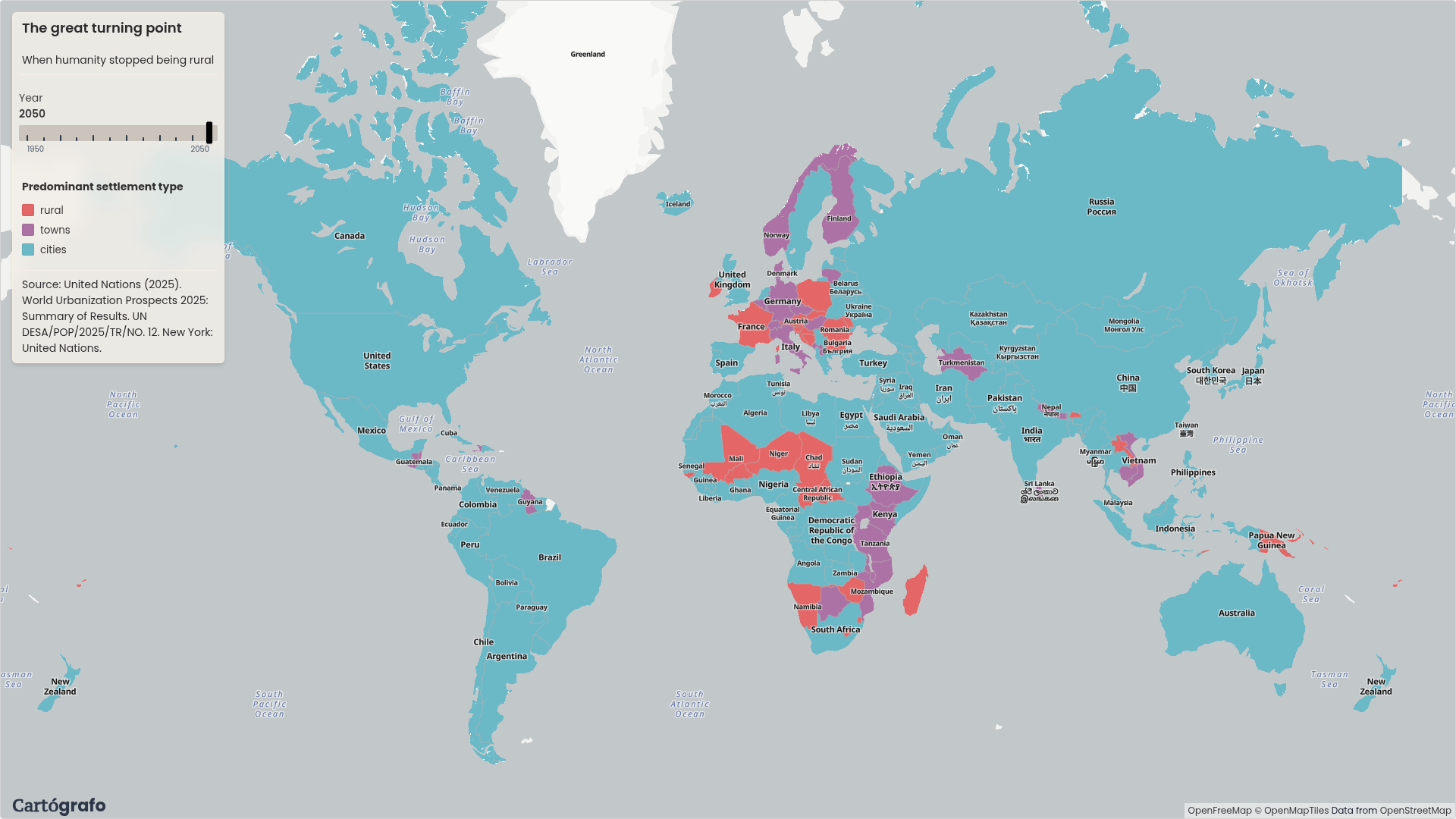
That stability is useful because it prevents the map from telling a single story about every region. Some countries moved into the Cities category. Others stayed closer to their earlier structure.
The global south shifts toward cities
Outside parts of Africa, much of the global south moves toward the Cities category by the end of the timeline. The map makes that visible without using a separate chart: as the year changes, large areas move from Rural or Towns into Cities.
The exceptions matter too. They show that this is not a universal sequence. The same classification is applied everywhere, but the timing and final category are different.
Built as a graph in Cartógrafo
The map was built in Cartógrafo from WUP 2025 DEGURBA Level 1 data and country boundaries. The graph filters the timeline years, pivots Cities, Towns, and Rural into columns, calculates the predominant category for each country and year, joins the result to country polygons, and exposes Year as a filter widget.
The analysis stays inside the map graph. The slider does not need the pipeline to run again; it filters the already prepared country-year data on the client.
A Map Aficionado?
Subscribe to our newsletter and receive cool maps in your inbox