Four paths of urbanization
May 4, 2026
This map compares two parts of urbanization at the same time: the change in the population share living in Cities, and the change in the population share living in Towns. Each country is classified into one of four patterns for each 15-year period.
The categories are plain: Cities and Towns both up, Cities up and Towns down, Cities up and Towns flat, or Stable. That makes it easier to see when urbanization means growth across the urban system, and when it looks more like a shift away from towns toward larger cities.
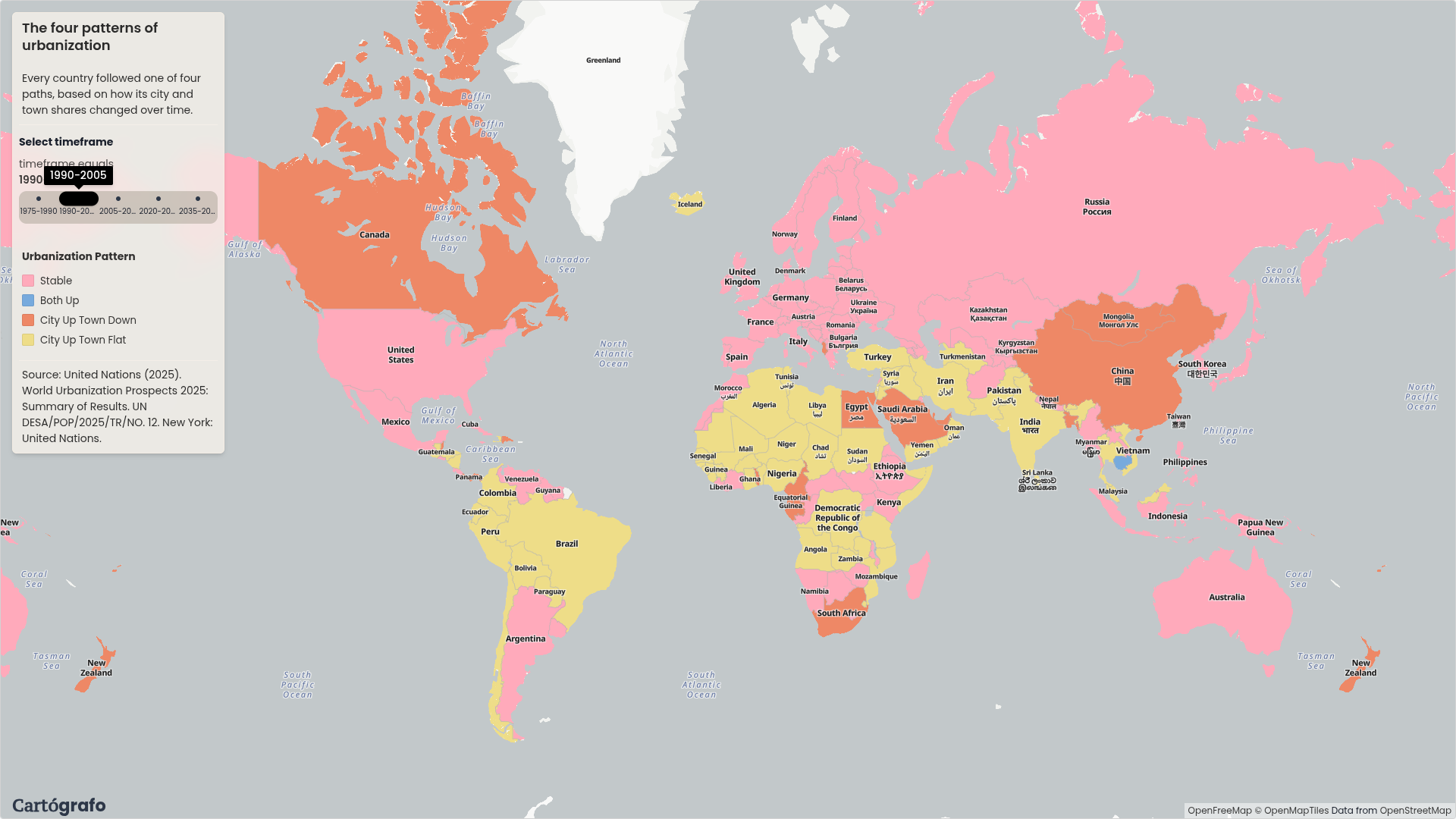
When towns shrink and cities grow
One pattern shows up in several countries: the share of people in Cities rises while the share in Towns falls. Brazil had this pattern from 1975 to 1990. Canada, Mexico, Venezuela, and Iran also appear in this group in the data. China shows the same pattern from 1990 to 2005.
That is the map's main story. In these cases, urbanization is not only a move out of rural areas. It also looks like a move away from smaller urban settlements and toward larger cities.
The pattern changes over time
After that stage, the map becomes more settled. Towns stop falling in many countries, while Cities keep growing. Later, more countries move into the Stable category.
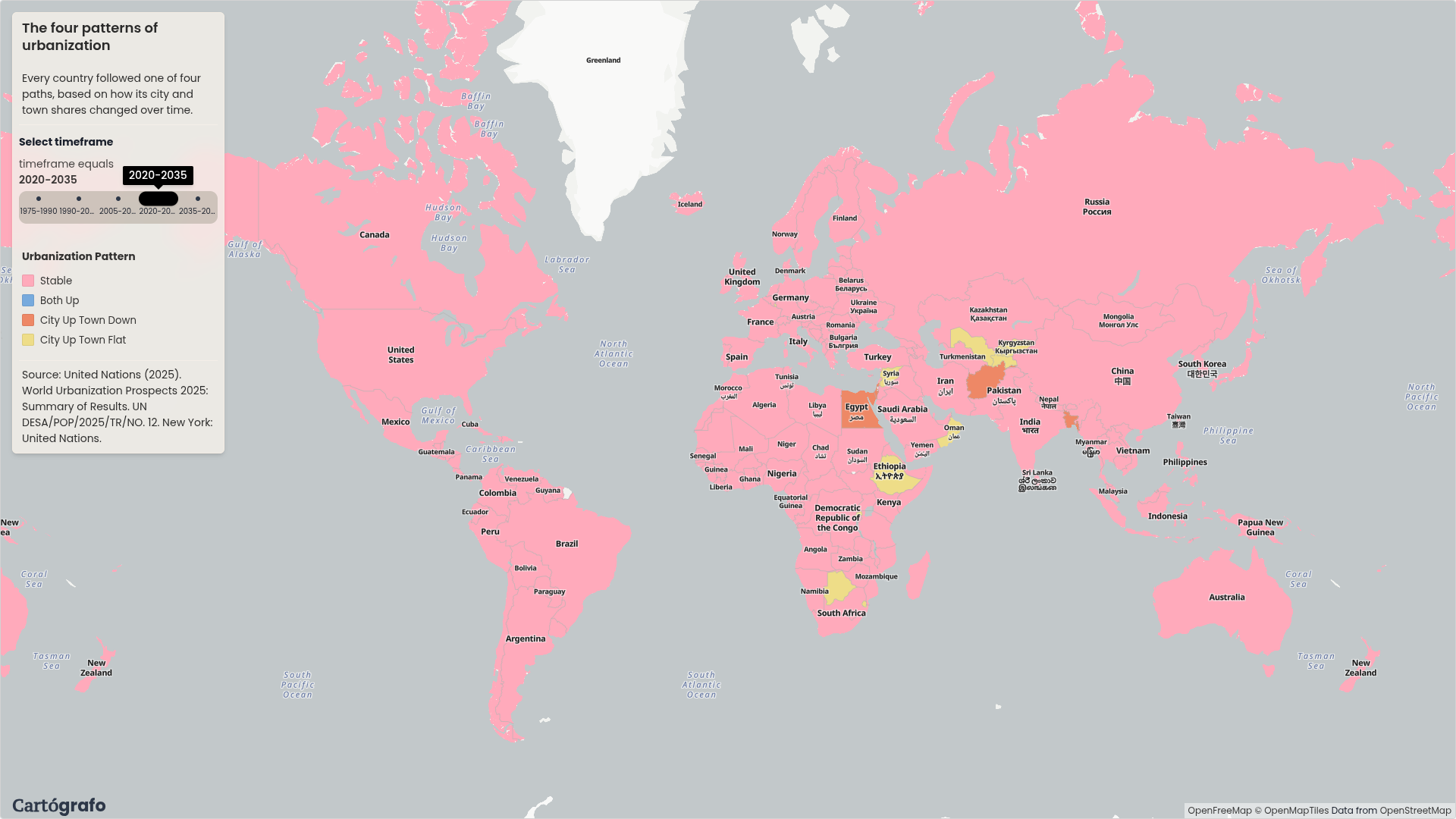
The 2020-2035 view is much more stable than the earlier periods. The same classification is still being applied, but the map has fewer countries in the "Cities up, Towns down" pattern.
Europe is stable from the start
European countries are already stable from the beginning of the dataset in 1975. In this map, Europe does not show the same large transition from towns to cities that appears in some other regions.
That matters because the map is not only showing where urbanization happened. It also shows where that process had already slowed down before the first period in the data.
Both towns and cities growing
Only a smaller set of countries appears in the "Both Up" category. Ethiopia, Kenya, South Sudan, and Nepal are examples where the share of population in both Towns and Cities grew in the same period.
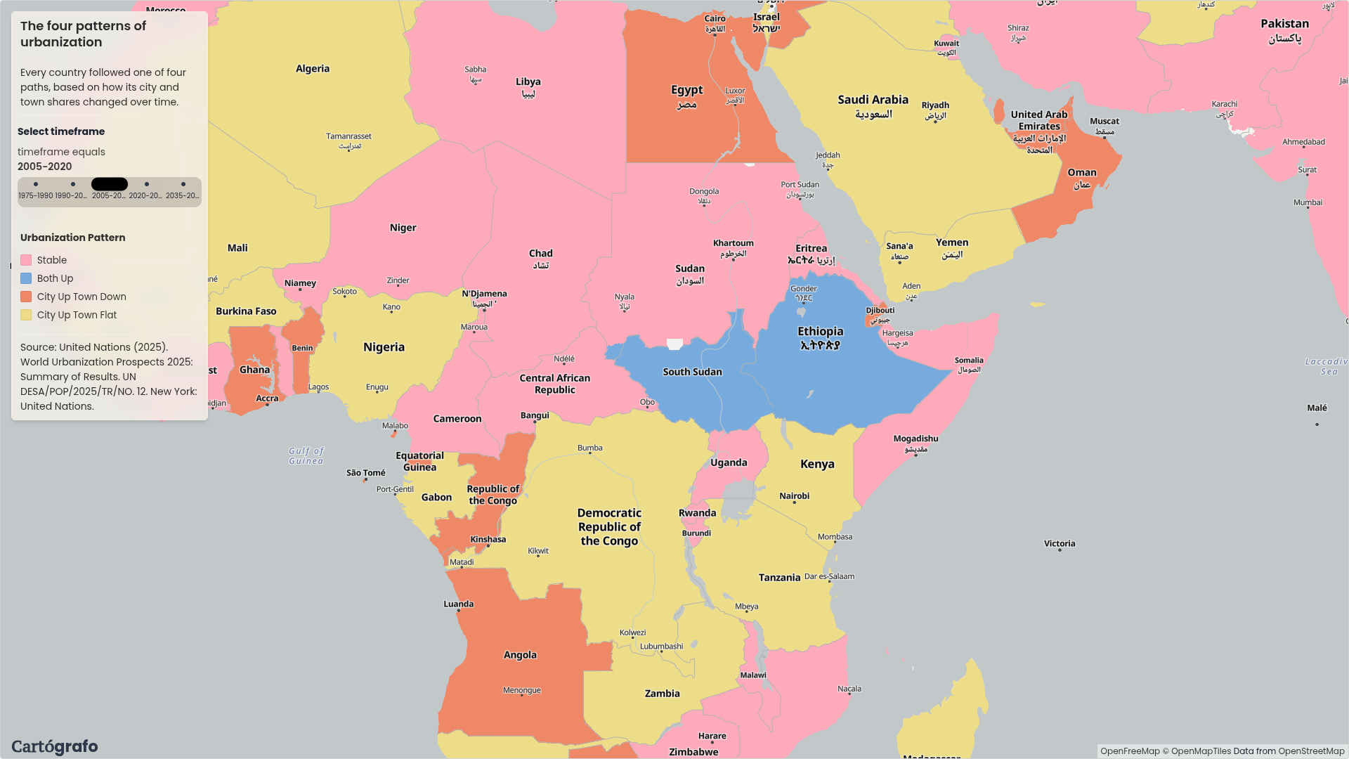
This is a different kind of urbanization. The country is not only concentrating into larger cities. Towns are also gaining population share.
Built as a graph in Cartógrafo
The map was built in Cartógrafo from WUP 2025 DEGURBA Level 1 data and a country boundary layer. The graph filters the data to countries, pivots Cities and Towns by year, calculates changes for each 15-year period, classifies each country, stacks the periods into one table, and joins the result to country polygons.
The filter widget switches the visible period. The map layer keeps the same four categories, so the changes over time are easy to compare.
A Map Aficionado?
Subscribe to our newsletter and receive cool maps in your inbox